Hearing technology / Mobile app
Lucid HearingA hearing-aid app for every age
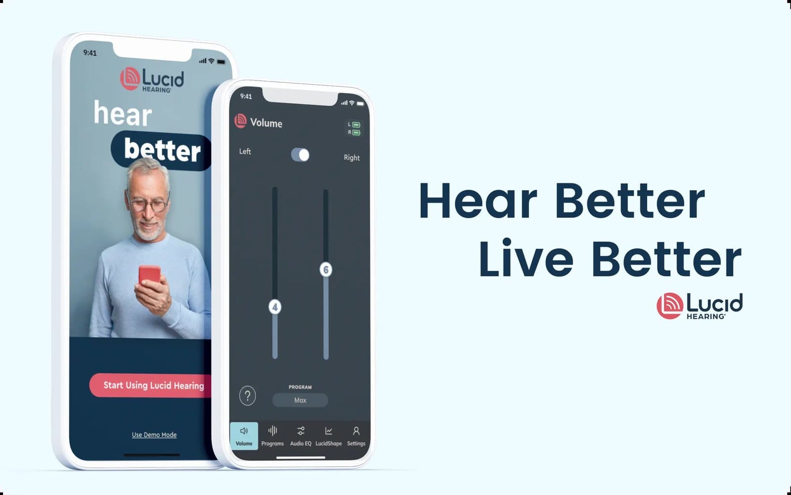
The companion app for Bluetooth hearing aids, redesigned so a 75-year-old and a 25-year-old both find the volume in one tap, with account, telehealth, and subscription features added on top, inside programs that lifted sales 1.5x.
- Client
- Lucid Hearing
- Sector
- Hearing technology / Mobile app
- Scope
- User research, app UI/UX redesign, backend integration design, telehealth and subscription features, localization tokens, usability testing
- Role
- Principal design
1.5x
Sales increase across the program, per program analytics
93%
New-account retention after the redesign
110%
Increase in customer engagement
Overview
Lucid Hearing sells clinical hearing aids through more than 500 clinics and over-the-counter models through big-box retail. The company wanted its mobile app to match the quality of the hardware: intuitive, visually clear, and connected to the systems behind the products.
The challenge
Two audiences, one app. Older users need large targets, plain language, and a volume control they cannot miss. Younger buyers of over-the-counter aids expect a modern product. Both had to feel served by the same screens, and the app had to grow from a remote control into an account, a clinic, and a store.
The approach
Research with both demographics. Interviews and usability sessions with older and younger users set the rules: fewer choices per screen, icons that explain themselves, gestures that forgive.
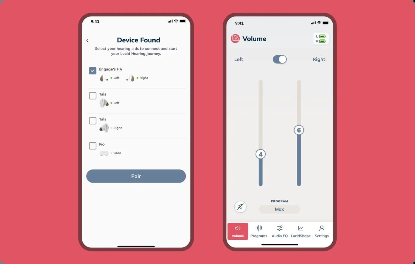
The everyday tasks first. Volume, programs, and pairing were redesigned to take one tap from launch, then everything else was layered behind them.
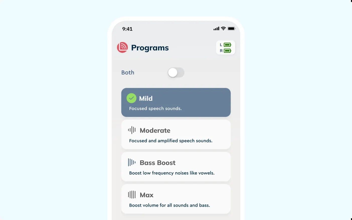
From remote control to relationship. Integration with Lucid's backend brought account creation, hearing history, appointment management, telehealth, and a proposed Lucid Plus subscription into the app, designed as flows before they were built.
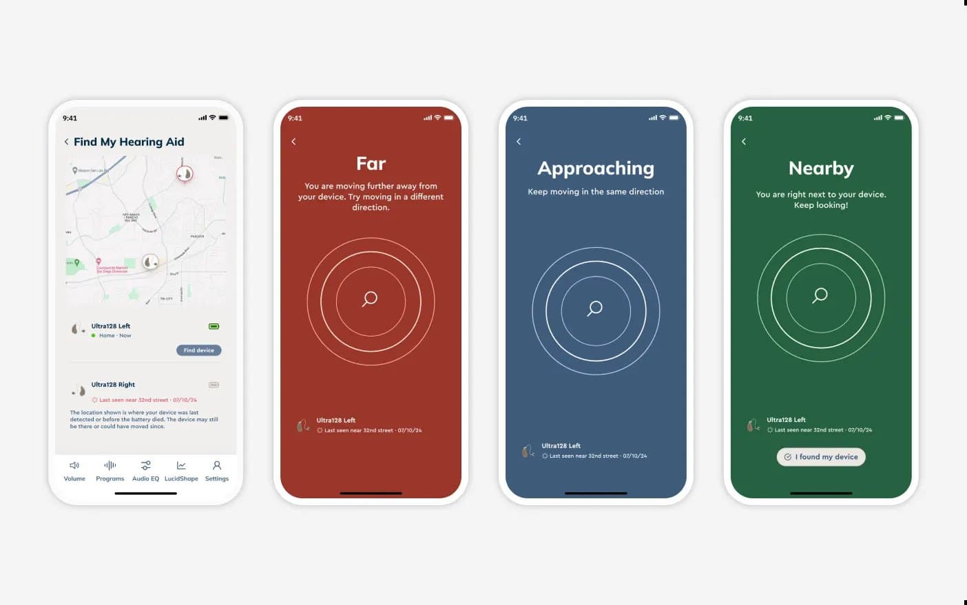
Built to localize. A Figma token system covering dark mode and language variants, so Spanish and Chinese versions could ship without redesign.
The outcome
New-account retention reached 93% and engagement rose 110% after the redesign, inside programs that increased sales 1.5x, per program analytics. The app now carries the account, the clinic, and the store, without losing the one-tap volume control the original users came for.